


Even though many of us now habitually use devices of different screen sizes in our everyday lives, when it comes to enterprise web development, we still tend to think of desktops as the be-all and end-all. Unfortunately, if you begin with a desktop-first approach and remove or shrink elements to fit smaller screen sizes, many elements don’t adapt well. Sites designed this way may be mobile-friendly, but they don’t offer a good user experience. With a mobile-first approach, designers start with user interface (UI) design for mobile screens and then go on to add functionality for larger screen sizes.
Designing the smallest interface first eliminates all non-essential elements to allow for faster and more fluid rendering while retaining core functionality. Given recent shifts in consumer habits and the evolving technology landscape, it’s no longer enough to treat mobiles as an afterthought. Enterprises have to think smaller think mobile-first.
Why do enterprises need a mobile-first design approach?
A mobile-first process allows enterprises to do a lot more and gain a competitive advantage. Here are 7 reasons why enterprise web development can benefit from a mobile-first design approach.
1. Reach a wider audience
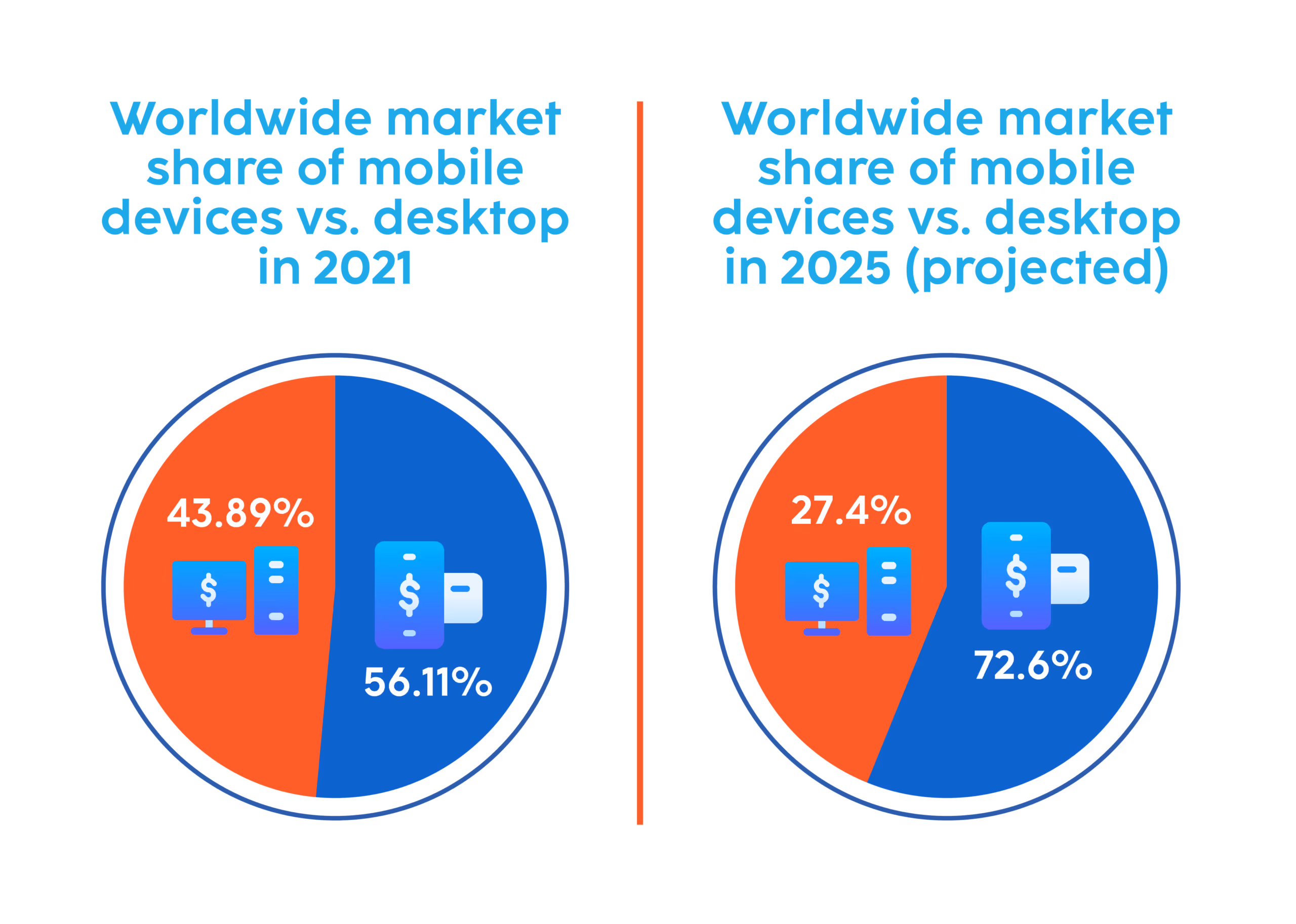
According to Statcounter, as of September 2021, 56.11 percent of traffic worldwide came from mobiles while only 43.89 percent came from desktops. According to estimates by the World Advertising Research Center (WARC), by 2025, almost three-fourths (72.6 percent) of users will use only their mobile devices to access the internet. That’s almost 3.7 billion people.
Even households that are unable to afford a desktop computer will have internet access via smartphones, making these devices critical for essential functions such as paying bills, applying for jobs, etc. These usage statistics present a huge opportunity for businesses to offer their products or services via mobile devices. This is in line with Google CEO Eric Schmidt’s 2010 assertion that mobiles will ultimately become the way that businesses provision most of their services. And this brings us to another reason to employ a mobile-first design approach. As mobile usage has outgrown desktop usage, Google has also switched its indexing algorithms to favor and primarily use mobile versions of websites rather than the desktop versions for indexing and ranking.
Mobile speed, interactivity, and visual stability are also key ranking signals. This means that if a website is optimized to perform well on mobile, it’s more discoverable through Google. And greater discoverability eventually means a higher potential for conversion. What’s more, smartphones can also improve access for people with visual or cognitive disabilities, meaning more people are able to use the products and services provided by a business.
2. Improve relationships and boost retention

A survey conducted in February 2021 found that almost half of smartphone users in the United States spend 5-6 hours on their phones each day. With near-constant access to customers, enterprises can use mobile phones to build better relationships with them by delivering engaging and valuable experiences. Chatbots, social media marketing, push notifications, and other such technologies can be deployed to increase customer engagement and ultimately customer retention. Customer service in particular is one of the areas for any product or service company that can really be elevated with a mobile-first approach. Recent trends such as personalization, omnichannel content delivery and commerce capabilities, social commerce, and augmented reality (AR) are set to completely transform how businesses can deliver services to customers over mobile.
Read more about Embracing Mobile Commerce for Breakneck Growth
3. Unlock new revenue streams
Mobile phones allow enterprises to employ different monetization strategies, creating new revenue streams. Some examples of potential monetization strategies include paid products and services, in-app purchases, premium capabilities, and more. Businesses can also gamify the mobile experience to increase engagement. The fitness industry and the academic industry have already taken huge strides in diversifying their offerings through mobile devices and gamifying the user experience (in the form of personalized coaching plans, daily challenges, etc). This helps them engage their existing customer base while also delivering an ever-widening range of additional offers and services to help increase their profitability.
4. Gain customer insights from data

Mobile phones allow enterprises the opportunity to collect valuable data about their users. This data can be gathered from wearables, smart home devices, or cars about users’ location, activity, and health metrics. As the Internet of Things extends to include more and more household electronics such as security lights and cameras, appliances, and temperature control systems, the amount of data available and its possible applications also multiplies. Enterprises can use this data to gain valuable insights into user behavior patterns and personalize experiences for them.
Read about how to Leverage AWS IoT Core for Connecting Devices to the Cloud
5. Improve UX and increase conversions
Given the space constraints on smaller screens, starting the design process with mobile phones makes sense. This is, after all, the most challenging part. A site that has a well-designed UI for the mobile screen will function effectively on larger screens as well because essential components of the user experience are already clearly defined and developed. It’s easier and more effective to start with a lightweight site designed for mobile and scale it up for desktop than to start with a complex, heavy site and try to scale it down for mobile.
Content has to be given first priority with a mobile-first design approach. Beginning with UI design for a mobile screen means that any vanity features are naturally eliminated. Designers can prioritize mission-critical elements and features. Next, they have to establish a meaningful visual hierarchy, making sure critical elements are displayed first. They also have to design an intuitive navigation flow, prioritizing the most important links and using drawers or hamburgers to display secondary elements. All this helps ensure that users are offered a seamless experience on any device. As a result, the bounce rate due to poor usability is reduced, users have better experiences, and the conversion rate increases.
Read more about Mood Boards and How They Are Important in the UX Design World
6. Improve performance across channels.
If a site is designed for desktop and then elements are removed to make it suitable for viewing on mobile, it’s likely that it will retain a lot of unnecessary bloat and be quite buggy. On the other hand, if a site is designed for mobile and then elements are added while building the desktop version, it will remain as lean and efficient as possible, and have minimal bloat and much fewer bugs. To a degree, designing with constraints automatically improves the quality of the product. With fewer elements overall and a design that’s optimized for mobile, the site will be lean and fast, able to load quickly even in low bandwidth conditions. This can be a significant differentiator for businesses because even a 1-second delay in loading time is known to lead to a 7 percent loss in conversions.
Read about the 10 Best Mobile Application Testing Tools For 2021
7. Make better decisions with real-time data access

Enterprises can also develop corporate websites and applications that help them to communicate with their own employees. This can be useful in industries such as consumer goods, insurance, pharmaceuticals, and industrial products where there are usually many employees in the field at any given time. Adopting a mobile-first design approach keeping these users in mind can help with data collection and providing quality services to customers. It can enable quick decision-making based on real-time data that is available to everyone across the organization. This saves time, reduces cost, and increases efficiency.
Conclusion
Global conversions on mobile lag slightly behind desktop, mainly because of usability challenges on mobile. Businesses haven’t yet fully capitalized on the power of mobile. But this won’t always be the case. As smartphones proliferate, more and more businesses will recognize and capitalize on the potential that they offer, especially as faster mobile internet speeds become available worldwide. With time, the mobile conversion gap is closing. And enterprises should act now to prioritize delivering better experiences with a mobile-first design approach, seizing the advantage while they still can.
Read more about How to Select the Best Pricing Strategy for Your Mobile App


