Imagine, while navigating countryside roads with little to no signage, your Google Maps application starts to malfunction and leads you on a longer and inconvenient path. After hours of reaching halfway to your destination, the application shuts down altogether. Now, despite knowing your objective, you’re lost. How would that make you feel? Most likely, frustrated.
Likewise, poorly designed eCommerce websites create a horrible experience for visitors. Due to inconsistent or absent navigability, they cannot select or discover products within a sprawling catalog.
So, what do these visitors do? You guessed it right – they leave.
Too often, eCommerce businesses prioritize aesthetics over functionality, treating design as embellishments to beautify their website. As per research, 42 percent of people will leave a website because of poor functionality, and these businesses need to reimagine their user experience strategy.
A key component of a good website experience is seamless navigation, especially for content-rich and multi-layered eCommerce websites.
Let’s look closely at how navigation structures for eCommerce websites are built and implemented.
Types of Web Navigation Structures to Explore
Before implementing a website navigation structure, it’s crucial to determine what kind of structure your eCommerce website needs. Most navigation structures can be put under three primary categories – structural, associative, and utility.
Let’s explore each of these in more detail.
Structural
This type of navigation design follows the hierarchical structure of a website. It allows users to move across different layers of the site. Structural navigation design further splits into two parts.
1. Global Navigation
This represents the website’s primary pages and shapes the overall site structure. This type of navigation helps the user find out if a website is relevant to them, orient themselves, switch between pages, remind users of where they are on a site, and give an overview of the website.
2. Local Navigation
This represents page-level navigation and is a subset of global navigation. This form of navigation goes into the depth of a product or category page, helping users gather context and aiding them in discovering related pages, thereby promoting site exploration.
Associative
Associative navigation connects pages across different hierarchies. To understand this better, let’s look at the three major forms of associative navigation –
- Contextual
- Quick links
- Footer navigation
1. Contextual Navigation
A form of situational navigation that is either directly embedded into the text or is placed as a related link, close to the main content. Leading eCommerce websites have automated this through AI-powered product recommendations based on user behavior.
2. Quick Links
These are a subset of contextual navigation and give access to the entire website. Usually, these links are connected to pages that are visited most frequently.
3. Footer Links
A standard feature of any website and redirects users to information not relevant to their shopping goals. These links include company details, careers page, FAQs, terms and conditions, contact information, social media links, and even redirects to corresponding international websites.
Utility
Utility navigation enables users to access areas of an eCommerce website that can assist them in their shopping process. Examples of utility navigation features include a search bar, shopping cart, linked logos, login and sign-up links, language/location selectors, customer support, etc.
To build an eCommerce website that provides an exceptional user experience, businesses can combine two or more of these website navigation structures.
Must Read: 10 Essential Ecommerce Website Features To Take Your Digital Store To The Next Level
How to Implement eCommerce Website Navigation
According to academic research, a proven and future-proof methodology to execute impeccable website navigation design includes the following steps.

- Collecting primary and secondary insight on on-screen behavior, i.e., understanding how users interact with and maneuver through your website. Here, it’s critical for e-retailers to put the customer at the heart of web design and to experiment, test, and learn to enhance user experience constantly.
- Conducting an audit of existing digital designs and comparing them with obtained behavioral insight. This can help enterprises identify gaps in user experience and incorporate fresh and optimized designs to deliver a superior shopping experience.
- Testing new designs under control conditions to identify flaws and rectify them. Usually, this will be a part of the design team’s standard testing process.
- Deploying and scaling an optimal design across a host of digital journeys once the right website navigation structure has been identified.
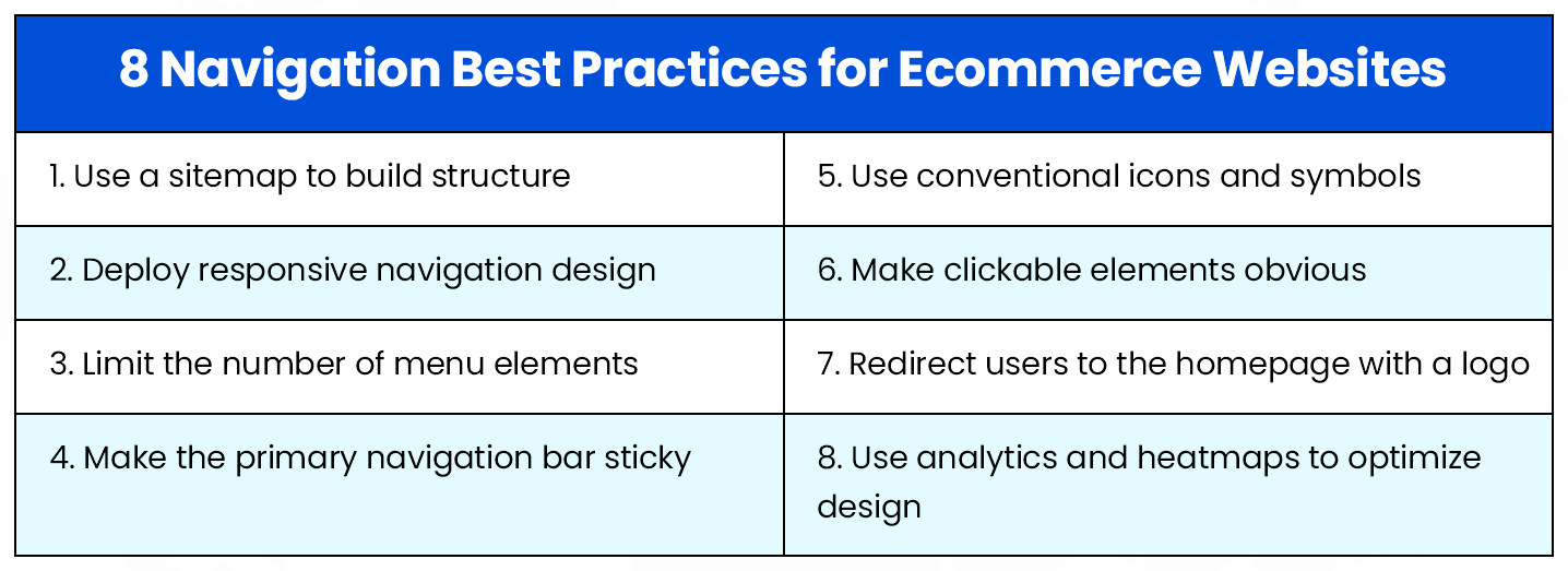
Ecommerce Website Navigation Best Practices
Creating an effective navigation structure and flow for your ecommerce website doesn’t need you to reinvent the wheel—trial and error by e-retailers has brought to the forefront some best practices that are proven to elevate user experience and help businesses achieve their key performance indicators (KPIs).
Let’s explore 8 such best practices, gaining a logical understanding of why these tactics work.
1. Start with a site map
Unsure of where to begin creating a web navigation structure? An excellent place to start is with a sitemap of your website. A sitemap is an outline of all the pages on your website and a perfect blueprint for your sophisticated navigation-optimized web design. Sitemaps are also critical from an SEO standpoint.
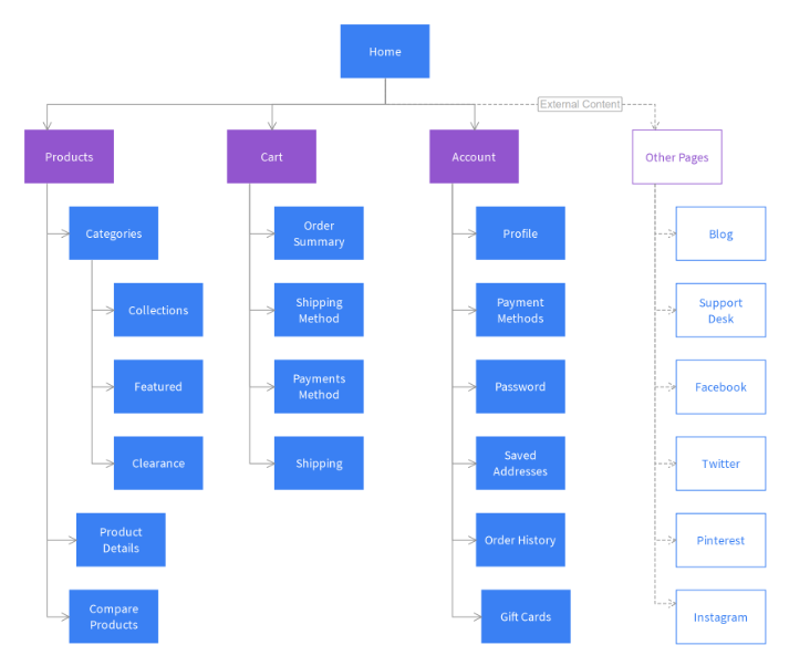
Visualization of the sitemap for a generic ecommerce website. (Source: Moqups)
You can build a sitemap manually through a text editor, automatically through third-party sitemap generators, or your content management system. While doing this, follow a set of guiding principles to delineate your site structure optimally and extensively.
2. Deploy responsive site navigation
It’s easy to make a case for responsive web design – by the latest estimates, mobile accounts for at least half of all web traffic. Further, Google, which accounts for 94 percent of organic search traffic, prioritizes mobile-optimized websites while ranking them on the results page. Therefore, optimizing your website from a volume and SEO standpoint makes sense.
While creating a responsive navigation structure, it is suggested to use a mobile-first approach. Moreover, answer the questions around which type of menus to use, which links to show, font and icon size, user behavior, and how it all translates to the bigger screens such as desktops and tablets.
Also Related: Shopify Migration Experts
3. Limit the number of menu levels and options
Ecommerce businesses may have many categories and products to display and sell. However, it’s essential to ensure that visitors are not overwhelmed by the sheer volume of options available. This principle must also be adhered to while creating a website navigation structure.
An industry best practice is to limit the number of options across all navigation menus. Further, large enterprises that cannot avoid showcasing a large volume of categories can use menu levels in the top navigation bar – but not more than two levels.
4. Make the primary navigation bar sticky
A sticky navigation bar is locked into place as the user scrolls down to discover your website, preventing the need to scroll back up to navigate to another web page within the website. Sticky navigation bars make browsing an eCommerce website much faster and simpler, especially when there are many options to explore.

Nykaa uses a sticky primary navigation bar that doesn’t force users to scroll back up to explore more categories and products. (Source: Nykaa)
Some best practices while deploying sticky navigation bars include the use of collapsible menus, avoiding hiding the search bar, and using Cascading Style Sheets (CSS) for simple yet impactful coding of a navigation bar.
5. Use widely accepted icons and symbols
Icons and symbols are used on websites to make information more visual and eye-catching. Icons can improve the appearance of unordered lists, highlight features, convey visual metaphors and synonyms, and aid navigation to utility features of a website such as a search bar, login page, contacts page, etc.
When it comes to using icons and symbols, it’s best to use conventional icons that are familiar to users and convey meaning without ambiguity. Straying from using universal icons can lead to a poor user experience and higher drop-offs.
6. Make clickable elements recognizable
When it comes to web design, this is a fundamental guideline that cannot be ignored. Even the most intuitively placed internal links to navigate web pages may be rendered useless if a user is unable to determine whether the text is clickable or not.
A good practice is to set a strong and consistent visual cue for clickability using borders, underline, differently colored hyperlinks, buttons that resemble physical buttons, and others.
7. Make the logo clickable and lead to the homepage
This is one of the most commonly known and critical elements of good website navigation. In fact, research shows that 95 percent of users know that clicking on a logo will return them to the homepage of a website. Therefore, it’s important to have a logo that redirects visitors to the homepage of an eCommerce website.
Another key factor to consider here is the location of the logo – research suggests that going back to the homepage is six times harder when the logo is placed at the center of a page compared to when it’s placed in the top-left corner. Further, the same study also indicates that brand recall increases by 89 percent when the logo is on the left instead of the right.
8. Use analytics and heatmaps to improve
When it comes to website design, there may be a slip between the cup and the lip. No matter how optimally designed, your navigation structure may not drive the business impact you’d imagined. Here, analytics and heat-map tracking can be of assistance.
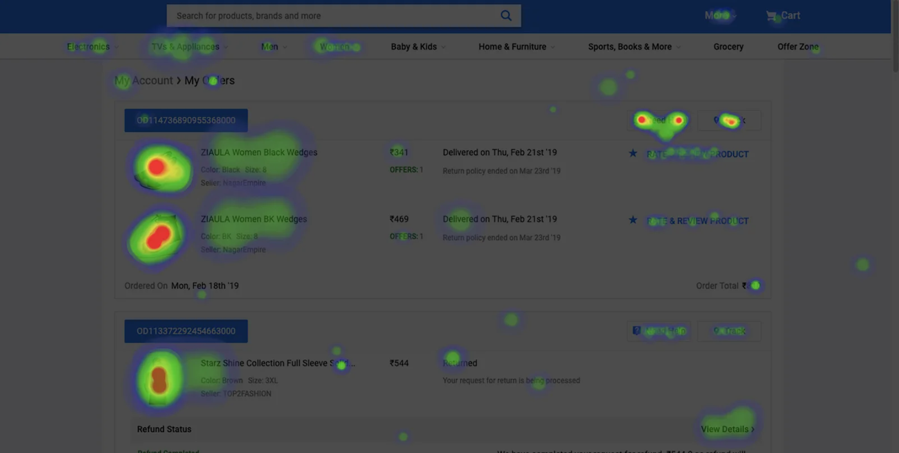
This heatmap of the ‘My Orders’ page on Flipkart shows how users interact with the page. (Source: VWO)
For instance, using analytics tools like Google Analytics and heatmap tracking tools such as Hotjar or Smartlook, website owners can identify exactly how visitors use their digital storefront, identifying and eliminating bottlenecks that keep visitors from turning into customers.
Also Read: Choosing the Best Payment Gateway for Ecommerce – 10 Key Factors to Consider
Design Your Website as Your Customers Want
Before executing a complete overhaul of your existing eCommerce website, it’s important to consider what your customers truly want. For this, you must understand their needs and goals, how they prefer to achieve their goals, and where they go when they fail or succeed in accomplishing their objectives.
From deep analytics and multivariate testing to usability tests and card sorting, there exist many ways to find answers to these questions. But the key is to focus not on what you want the customers to do but what they want to do. Only then can you engage your customers and empower them to take action!
Read Next: How to Leverage Ecommerce Product Recommendations to Create Outstanding Shopping Experiences

