


“If you can’t measure it, you can’t improve it.” — Peter Drucker
Measurement is at the heart of understanding whether a product, service, or design is good enough to meet customers’ requirements, or if it needs to be refined further or changed altogether. For designers, metrics provide signs that show whether their UX strategy is a success.
While there exists a surfeit of UX metrics that you can track, like the PULSE metrics (PULSE stands for Page views, Uptime, Latency, Seven-day active users and Earnings) or Google’s HEART metrics (HEART stands for Happiness, Engagement, Adoption, Retention, and Task Success), some may be more important than others to your design goals. The metrics that align best with your key design objectives are the ones that you should choose to be your Key Performance Indicators (KPIs).
UX design is driven by constant improvement through multiple design iterations, and KPIs can help this process by providing hard evidence which can guide your decision-making process.
Two categories of UX KPIs that experts track
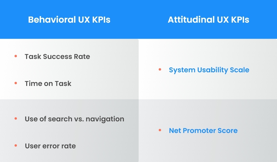
Measuring UX KPIs involves more than just tracking how your customers are using your offering. It also involves tracking what they say about their experience using it. This is why experts split UX KPIs into two categories:
- Behavioral performance indicators, or what customers do with your offering or website.
- Attitudinal performance indicators, or what customers feel about your offering or website. Tracking attitudinal KPIs is an attempt to quantify qualitative data.
Given below are six commonly used UX KPIs, categorized as either behavioral or attitudinal.
Behavioral UX KPIs: Tracking what your customers do
Tracking behavioral KPIs helps you understand whether your customers are using the product or service as intended, or if they are having issues that need to be fixed. These are some commonly used UX KPIs that fall into this category:
1. Task success rate
Task success rate or completion rate is a fundamental and commonly used metric for usability. It is the percentage of users who were able to successfully complete a task in a study.
To measure task success rate, the end goal must be clearly defined for the user. Examples of end goals include completion of a sign-up process, or successfully adding a product to the shopping cart.
So, what is a good task success rate to aim for? This is tied closely to the context in which your product or service will be used. If the cost of users not being able to complete the task is low, a lower completion rate may be acceptable. However, the higher the stakes for your users and business, the higher you’ll need to set the standard for task success rates. For instance, a healthcare application will need to allow much less room for failures than a web application for social media.
It must be noted that task success rate, while a useful metric, doesn’t explain how well users perform a task or why they fail to complete them — only that they’ve completed or failed to complete a task.
Read 25 Critical Questions to Ask When Starting a UX Project
2. Time per task

The time per task metric measures the time it takes users to successfully complete a task.
In most cases, except when a task is meant to keep a user engaged, a long task time may indicate a design issue. It’s likely that users are overwhelmed by the task, and thus spend more time on it than necessary.
This is where measuring time per task can be helpful. This data can be used to identify areas where it’s necessary to reduce the number of steps required for a user to successfully complete a task.
Read A Beginner’s Guide to User Research
3. Use of search versus navigation
Navigation features, such as hamburger menus or vertical sidebar menus, are instrumental in helping users reach their destination. However, if the navigation features of a design don’t help users find what they need, then the search function is the next step.
The ideal ratio of users using the navigation feature vs. users using the search feature should be decided on a case-by-case basis:
- If your website design comprises minimal navigation features, your search to navigation ratio will need to be higher.
- If your website design comprises standard navigation features and a standard search box, your search to navigation ratio will be closer to 1.
- If your website design comprises standard navigation features but no search box, your search to navigation ratio will be lower.
4. User error rate

In UX design, errors are crucial to understanding how well your design works. Learning why users are making errors when using your design can help you take steps to prevent them in your future designs.
The user error rate metric tracks the number of mistakes a user makes while completing a task. This can be a reliable indicator of the user-friendliness of your design.
Before calculating the user error rate, it is important to define which actions represent an error. For instance, an error may be a user typing in both their first and last name in the ‘first name’ field, or entering alphabets or special characters in a section meant for only numbers.
User error rate can be computed in two different ways:
- Error occurrence rate, i.e., if you aim to track only one specific error per task.
- Average error rate, i.e., if it is possible for a user to make multiple errors per task.
Attitudinal UX KPIs: Tracking what your customers feel
Attitudinal metrics are used to track the user’s subjective experience. Since they reveal how users feel about a product or service, these metrics can be critical for understanding what drives customer satisfaction and loyalty. Some of these are:
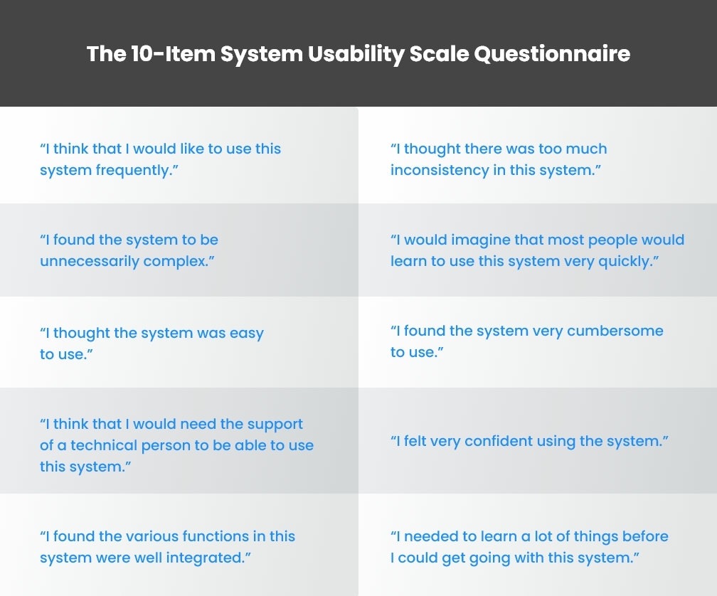
1. System Usability Scale
The System Usability Scale (SUS) is a reliable tool for measuring usability. It uses a 10-item questionnaire with varying response options that range from ‘Strongly Agree’ to ‘Strongly Disagree’:
SUS is designed not as a diagnostic tool but to get fast, unfiltered feedback on the effectiveness of your website or app design, as well as the satisfaction of your users.
SUS can be beneficial to UX designers since:
- It is easy and inexpensive to conduct a survey among participating users.
- It can be used on small sample sizes with reliable results.
- It can effectively distinguish between usable and unusable systems.
Based on research, the average SUS score is 68. Scoring above or below the average can give you some insight into the overall usability of your offering or website design.
Read A Complete Guide to Heuristic Evaluation
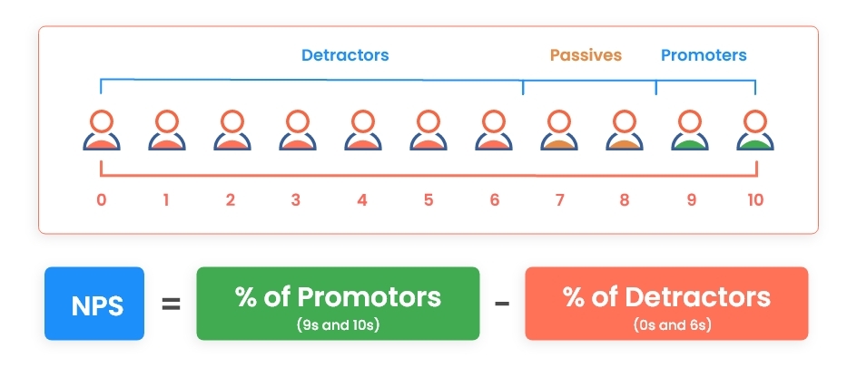
2. Net Promoter Score
The Net Promoter Score (NPS) is a metric that quantifies how many users are likely to recommend your website or offering based on their experience with it.
The NPS is based on a single question: “How likely are you to recommend this product/service to a friend or colleague?” This can be an indicator of how satisfied your customers are with your offering.
NPS is different from the System Usability Scale (SUS) in that the NPS tests users’ overall likelihood of recommending a product, service, or site, while SUS focuses on how users felt while using it.
Read Why Creating User Personas Is Crucial to UX Success
Replace conjecture with evidence by tracking UX KPIs
By quantifying what your users do with your offering or your website and what they feel about it, you can identify what works and what doesn’t, and take decisions driven not by conjecture but by hard evidence.
The aforementioned performance indicators are the ones that are more commonly used by UX designers — but don’t restrict yourself to just these metrics. List down additional metrics important to your goals!
If you’ve tracked all the right metrics and launched what you thought was a great digital product, but are still struggling to attract new customers and retain existing ones, it may be time for you to conduct a thorough UX audit! Here are 6 key steps to performing a UX audit.