It’s not easy building a website that works, converts, and sells big — truly, it isn’t.
In fact, it is a huge challenge to create a robust, responsive design that is functional, aesthetically pleasing, AND feeds into your user experience. Kudos to you if you’ve aced it!
But is your website accessible to everyone? Does it accommodate the needs of every visitor that lands on your page, including those with visual, hearing, motor function, or cognitive disabilities? Because if not, you are ignoring a significant portion of your audience and also potentially losing out on revenue. According to the World Health Organization (WHO), more than a billion people — around 15 percent of the global population — experience some form of disability.
Knowing how to improve web design accessibility can not only help you reach a wider audience but also help you get more customers and boost your revenue. To help you out, we’ve listed 11 effective tips and guidelines for designers, UXers, content creators, and developers to make websites more accessible.
What is website accessibility design?
Web accessibility design is a focused practice in web development that aims at removing any (and every) barrier that can potentially hinder a person’s ability to access, navigate, or understand content on the Internet. Put simply, it is an inclusive endeavor site owners undertake to make sure their products are accessible to all users.
Read 25 Critical Questions to Ask When Starting a UX Project
Why should business owners care about website accessibility?

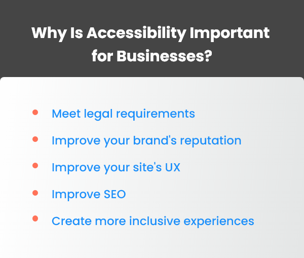
Here are some of the reasons why businesses should be concerned about making their websites accessible:
Reach a wider audience and unlock new opportunities: Web accessibility enables brands to reach bigger audiences worldwide. It helps them tap into new markets and unlock new revenue streams. Given that the disabled community holds a significant amount of the total spending power in the market, ignoring them means rejecting billions of dollars in potential revenue.
It’s the right thing to do: Websites are seldom designed with disabled people in mind. This tends to exclude an already marginalized community. When a website is accessible, it removes unwanted barriers and allows every user to participate and accomplish their goals. This could also mean a better reputation as well as more loyal customers for your brand.
It is legally required in some countries: The law requires businesses in many countries around the world such as the USA and the European Union to improve their websites’ accessibility. In fact, consumers have the right to sue brands that do not comply with this law.
These reasons make it critical for your business to explore how to improve web design accessibility.
How to improve web design accessibility: 11 tips
Here is a list of 11 tips to help you build and maintain an accessible website:
1. Choose an accessibility-friendly CMS
If you want to improve your website’s accessibility, choose a content management system (CMS) that offers extensive accessibility support. Your CMS should support authors in creating accessible content, for instance, by prompting them to add alt tags for images or transcripts for video content.
2. Organize and structure content with appropriate headings

People who use screen readers to access your content will be relying on the heading structure to navigate. Headings give structure to your webpage and improve its accessibility. Your headings should use appropriate tags to make your content easier to navigate.
These are some tips you can use to better organize your content:
- Use only one H1 tag per page. It is best to reserve this for the title.
- Allocate H2 tags for important subheadings.
- Use H3 tags to elaborate the subheadings marked with H2 tags.
- Avoid skipping heading levels; for instance, following an H1 heading with an H3.
3. Images must have alt tags
While images on a website are a must-have on websites, they tend to create barriers for the visually impaired. An accessible website will always have alt tags assigned to images which include a description of the image. This helps users with vision impairments to learn what the image contains with the help of a screen reader. It also gives your website a good SEO score. Win-win, right?
4. Link titles should be descriptive
These can also be important for people using screen readers to visit websites. Descriptive link titles help users learn the purpose of the link and understand where they will get routed, should they click on them.
5. Use color judiciously
Colors improve the readability of written text and help attract users’ attention towards content that site owners want to highlight. Ensure that there is high contrast between text and background colors.
If a user has color blindness or is otherwise visually impaired, it may be difficult for them to discover particular content items such as CTA buttons. UX designers should keep this in mind when designing websites.
Today, there are browser extensions available that help designers see images the way people with color blindness do. These can be useful tools to use when designing websites.
Read How to Create the Best Color Palette for Your Product’s UI
6. Forms must be accessible
Be sure to label text fields with descriptive titles on online forms. By doing so, you can ensure that visually impaired people can read the forms accurately and fill them without difficulty. Also, use label tags to further increase the accessibility of your website.
7. Use CSS instead of tables
When you use tables for page layouts, users with screen readers tend to have more difficulty understanding the text. This is because the text may be read in a manner that does not correspond to the visual arrangement on the page. To solve this issue, it is recommended that you use CSS to create your layout instead of tables.
8. Enable support for alternative hardware
An extremely important aspect of web design accessibility is to make navigation intuitive and hassle-free for people who experience motor function disabilities. To address their difficulties, be sure to include support for assistive devices such as head pointers and mouth sticks.
9. Test your web design accessibility features

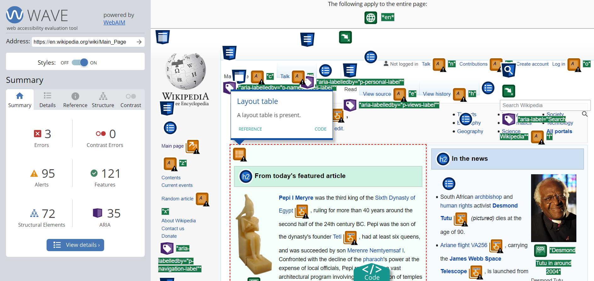
Applications like WAVE can help test the accessibility of your website
The best way to uncover any potential design flaws or bugs which may prevent users from accessing your web content is to test the website’s accessibility features. Tools like WAVE, JAWS, and Dyno Mapper can help with this.
Feedback from real users can also help you uncover aspects of your design that need fixing before your final launch.
Read A Complete Guide to Heuristic Evaluation
10. Use simple language
This is an important part of making your website accessible. To accommodate users with cognitive disabilities — such as intellectual, developmental, and learning disabilities — your content should be written in plain language. Use a clear and logical structure for your content, and avoid using complicated jargon and confusing terminology.
11. Implement accessible CAPTCHA challenges
CAPTCHA tools protect websites from spam by asking users to solve basic math problems or type text before they can access certain services. However, many users with visual disabilities struggle to use this feature.
Google has now simplified its reCAPTCHA tool which now lets users type text in a simple font or click on the “I’m not a robot” box to proceed. Take cue and implement similar measures to include people with disabilities in your web design.
Build accessible websites to gain a competitive advantage
Including accessibility features in the design of your website is not just a matter of social responsibility. It can also help improve conversion rates and site traffic, as well as reduce operational costs associated with acquiring new customers.
Today, web developers, UX designers, and content creators must know how to improve web design accessibility and ensure that accessibility is integrated into development right from the beginning. Begin with the tips we’ve listed above and keep tweaking your design based on feedback as you move forward!


