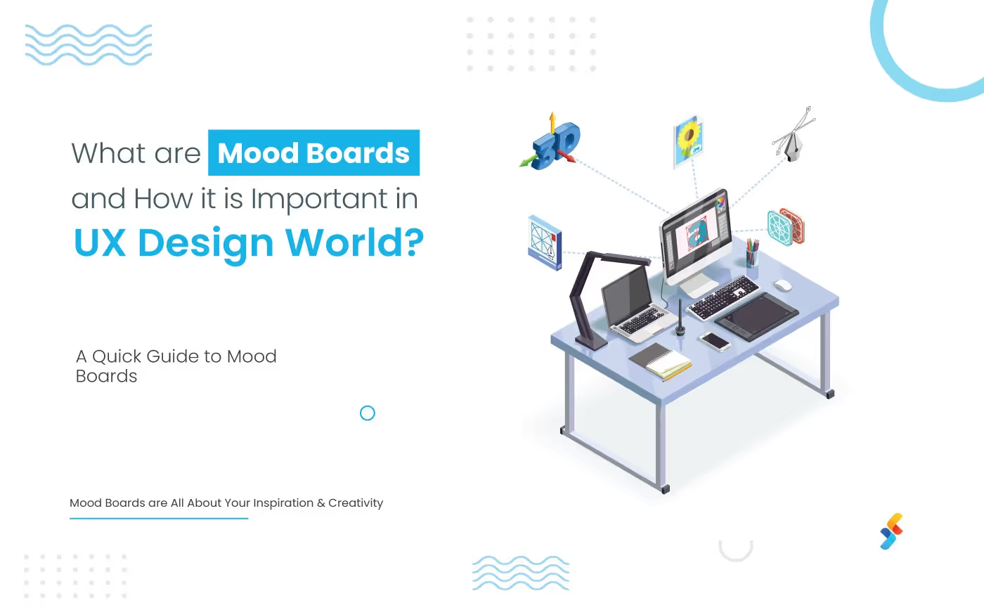
Summary: Mood boards are the most powerful tool in the creative field. They are a killer asset for both your blog and social media presence. In this blog post, we'll be briefing you about mood boards, their benefits, and some handful of tips for designing your own.
Do you think you need a degree in graphic design to create stunning and compelling mood boards? Do you think the best toolsets, a creative mind, & the right mix of motivation isn't enough? If yes, you need to read this. A smart guide to make mood boards & concept boards.
Have a look:
[caption id="" align="aligncenter" width="443"]

What are Mood Boards?[/caption]
What are Mood Boards?
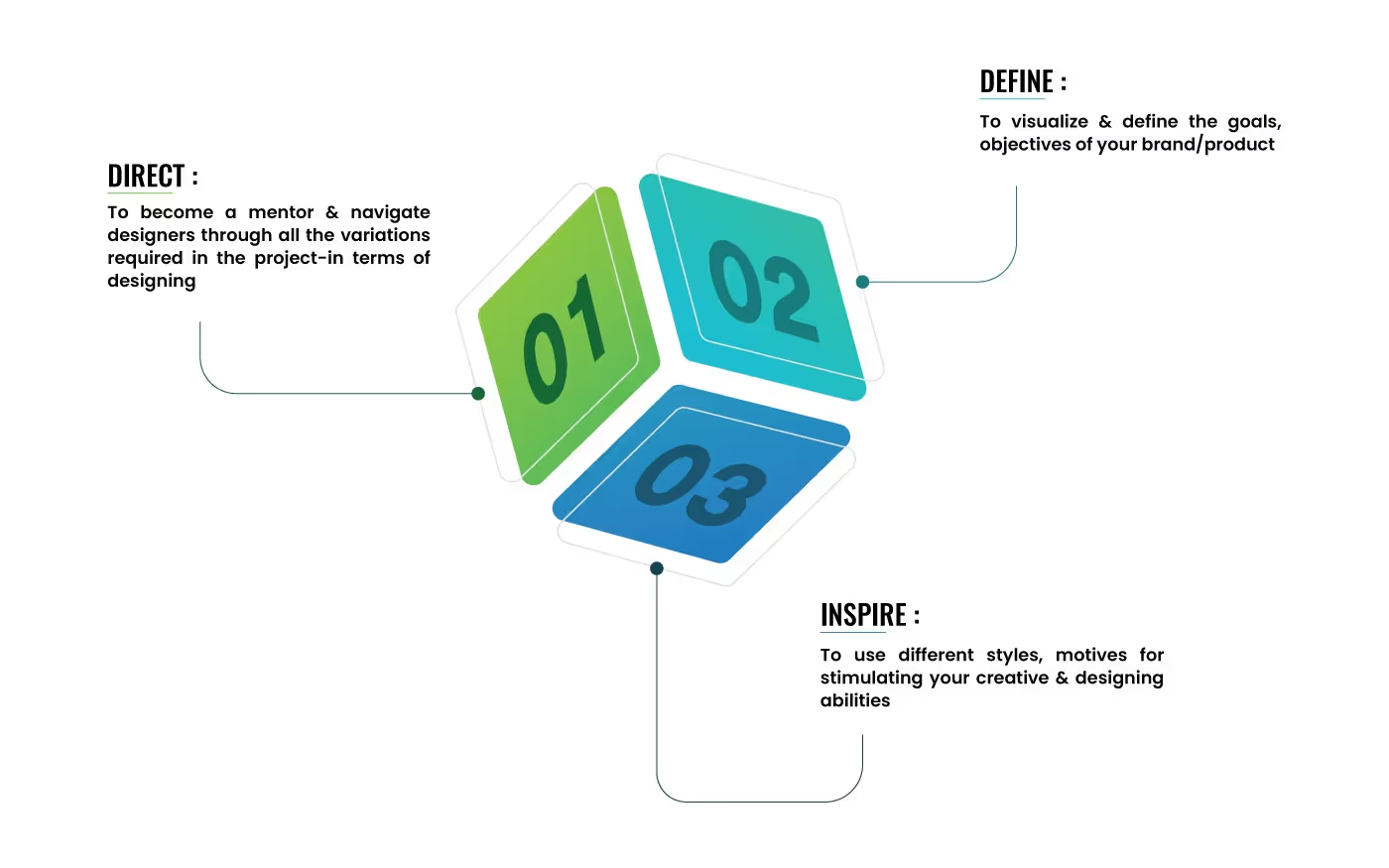
A Mood Board is actually the 'Board of Moods' placed together by the designer. It organizes your inspiration at the stage of concept creation. In technical terms, Mood Boards are the visual representation of a concept based design or rapid visual prototyping that includes creative images, typography, color palettes, and other materials. Three main purposes of Mood Boards:
Benefits of Mood Boards
- Quick mockup production
- Smooth client buy-in
- Less frustration, more creativity & fun
- Includes unique techniques to pitch colors
- Design process becomes streamlined and time-savvy
- Add Notes anytime
Tips to Make Amazing Mood Boards & Concept Boards
Creativity has no restrictions. Likewise, there are no limitations for elements in a Mood Board. You need to choose the right option, create the exact correlation & right balance between all the elements.
Start with a Color Palette
Develop a solid theme, explore new concepts, and make something amazing!
[caption id="" align="alignnone" width="483"]

What are Mood Boards?[/caption]
TIP: Use Adobe Kuler to create mood boards color palette quickly and easily.
Make Your Images Visually Cohesive
Your images should be closely-knit and make sure they match up.
[caption id="" align="alignnone" width="331"]

What are Mood Boards?[/caption]
TIP: Use images that are similar in shape, texture, and style to create a better impact
Set a Tone for your Mood Board with a Top Banner
Widescreen images work both as an inspirational and dominant image that sets the tone for the rest of your mood board.
Tip: Make sure your Top Banner is well aligned with the overall shape, style, texture, and color of your mood board to maintain consistency.
[caption id="" align="alignnone" width="403"]

Set a Tone for your Mood Board with a Top Banner[/caption]
Layouts!! Experiment with them
These small to large grids can entirely change the look and feel of your mood board.
TIP: Use:
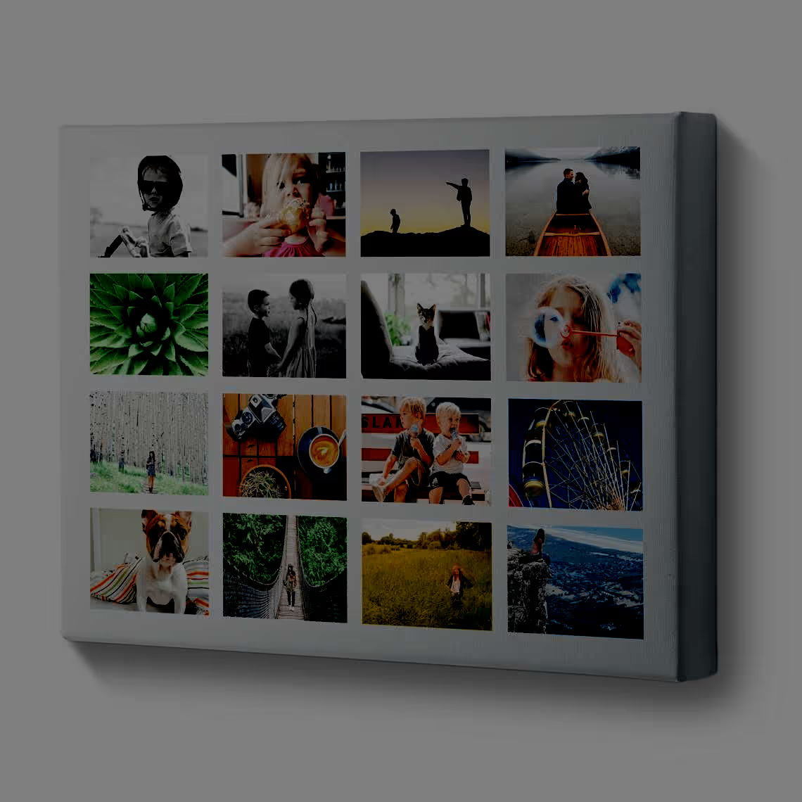
a) Running Bond Pattern: These are brick-paving patterns that showcase uniformity and robustness.
[caption id="" align="alignnone" width="422"]
Running Bond Pattern[/caption]
b) Classic Square Grids: To showcase alignment and balance in your design.
[caption id="" align="alignnone" width="382"]

Running Bond Pattern[/caption]
c) Mixed Grids: To showcase your uniqueness and creativity.
[caption id="" align="alignnone" width="466"]

Running Bond Pattern[/caption]
Conclusion
The prime advantage of designing a mood board is that there are no defined rules. Try it in your next project. We, at Successive Digital, blend creativity and innovation to deliver user-friendly interfaces and enterprise-grade quality designs, applications. Our design experts incorporate modern technologies and the right toolset to create interactive, user-centric, and result-oriented digital products. Contact us to get started with your creative journey.
.avif)
