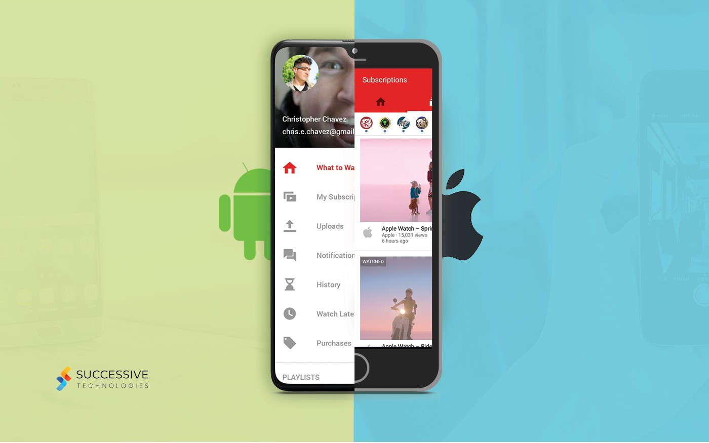
Building an app is about building it with design attracting the users. It is also about user-friendliness. The easy navigation of an app is going to make appealing to the users. Navigation is like a conversation. Besides, being catchy, the users don’t feel bored while using the app. An app should, therefore, be easy to use as well as attractive.
Nowadays, there are apps for almost everything; naturally, an app that is easy in navigation and intuitive at the same time is the one going to persist in the market or crush its competition. Some business statistics also say that optimum navigation has given an almost 15.68% increase in sales. We shall discuss more in detail as to what the basics of building mobile app navigation are.
The thumb rules
A mobile phone is designed such that we can handle the device with our palm and other four fingers and the thumb is the tool we use for navigation. Even with smartphones with larger screens, almost 50% of people using only the thumb and therefore, nearly all smartphones have adjustable screens at a swipe.
Navigation with thumb also makes the app ambidextrous; the users of right as well as left hands can use the app without any difficulty. For all these reasons, using the apps should be designed as easy to navigate only with the thumb. One of the ways to make the app thumb-friendly is by placing the essential tabs of the app closer to the thumb. This way, a user need not use the other hand and navigate only with one hand’s thumb.
Make the bottom bar noticeable
The bottom bar is the most central place for navigation. Most prominent companies are opting for adding tools there. A single bar can contain tools like search tool, home, ‘add to favorite,’ and compare. The bottom bar is also essential because it gives quick links to the app. We recommend you have a bottom bar with quick links for the centralization of the navigation. The bottom bar also makes the app more user-friendly with the thumb.
Add the search tool
Looking up the information is far more convenient than looking around for it through different tabs. New app users or those who do not understand technology can find it difficult or daunting to search different tabs for the thing they need. Remember that for the ease of convenience, most people like looking up information on the search engine instead of directly logging on to a website.
The search tool in an app has proven to be very useful, especially if the app has several tabs and a vaster repository of information. Also, the search results show results of a related search; once a user finds the information that he or she initially desired, then they can view the related search results to deepen their knowledge or extend it.


