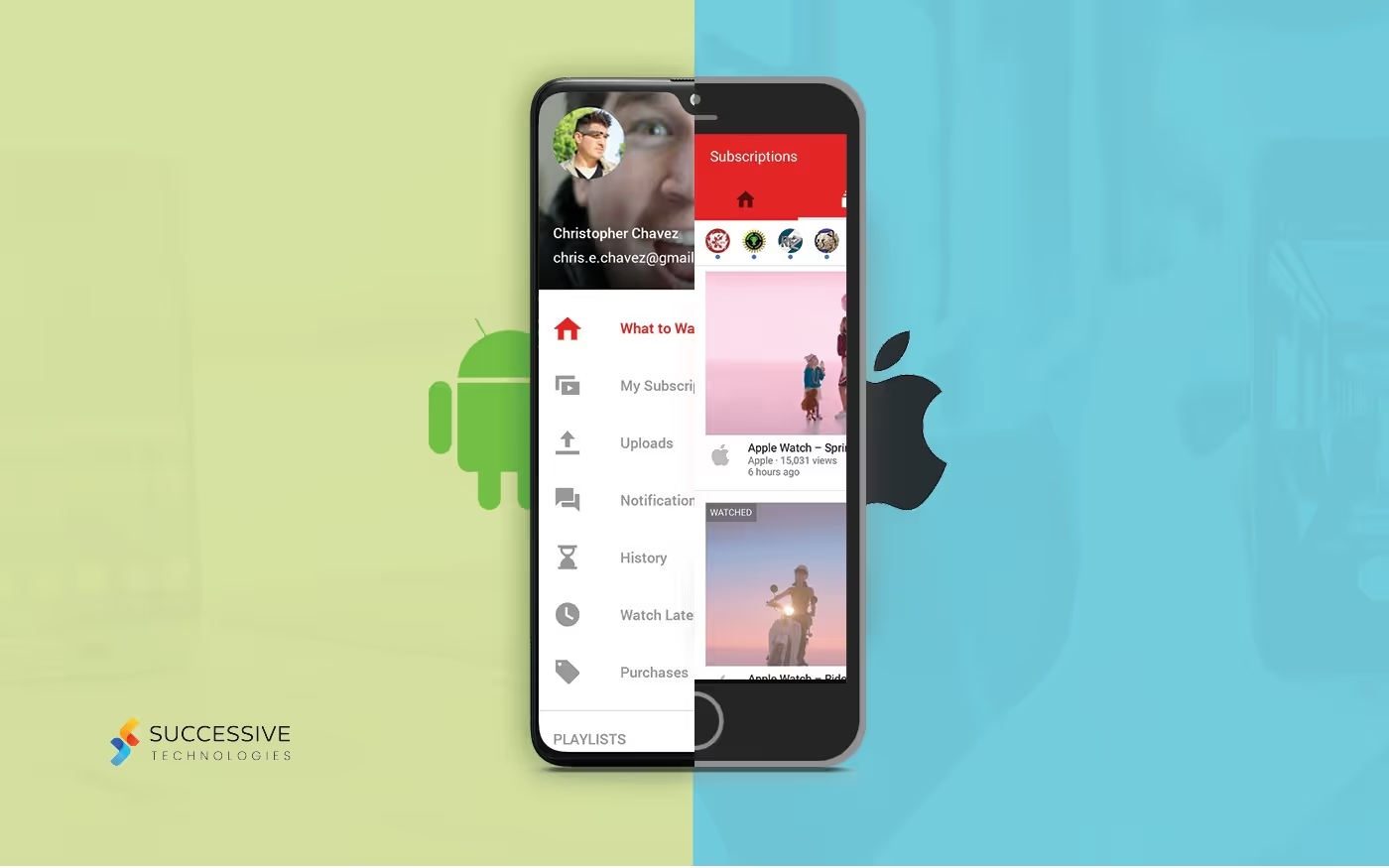
User Interface (UI) as dynamic as it is, individually takes yet another turn in the diversity section when we come to Android vs IOS.
You must have heard sagas of the differences between the android and iOS users each pleading a case of how their operating system is better than the other. But what you may not know is that this isn’t new, it has been the case for ages now. And, on no account can you term it as superficial. Android users do have a very tough time adjusting to iOS and vice versa. The “why” to this problem has a lot of little aspects and one major aspect. The major one is the differences in the UI of the two. Think about it, for instance, a layman while comparing two devices with these two operating systems may ignore for once, the differences in the complex configurations behind the processors in the two, but what he will always keep in mind is “how does is screen look?” “which icon goes where?” “how do you navigate through different pages?” and all of these have only one thing in common- UI.
Thus, it becomes essential for us to understand the differences between the UI in the two operating systems so that if need be we can make an informed choice and in a more competent fashion.
Now that we have started, we need to know where all will we be able to spot these differences. The best answer to this is — “If you scrutinize the subtle, then everywhere.” These differences are present everywhere — in the navigation bars, toolbars, types of control, buttons, and whatnot.
Out of these hundreds our focus first, obviously goes to navigation. Android is based on the material design guidelines, which is something widely accepted and followed globally even google uses them while developing its own applications. iOS, on the other hand, is based on the human interface design. One of the most noticeable differences in navigation is how android uses a “universal navigation bar” present at the bottom of the screen but iOS uses a combination of gestures and the home button. It also presents itself with an inbuilt “back button” in almost every one of its apps to help with the simple retracing of steps. Now you may be able to see how even a simple action as “going back” becomes so different with a change of UI.
Similar to navigation is another aspect — Menu. In Android, they generally have it in the form of a sidebar where you just tap and pull and voilà — you will have five to six apps ready to access. iOS, on the contrary, prefers a tab bar, which is placed at the bottom of the screen. These tab bars though according to various consumer analysis reports are easier to use, provide a lesser array of apps to be at the user’s disposal at one point of time.
The search field too is not left behind in this gabble of differences. In fact, the amount of comfort drawn from a device has a huge dependence on the accessibility of the search field, and its placing and presentation in the two operating systems play a pivotal role in materializing the differences between the two. One of the most distinguishing in this arena is the placement. iOS demonstrates a certain amount of rigidity as the full search bar is placed at the top of the screen. Whereas Android provides its users with a little bit of flexibility on the matter. It gives the users an option to place the search bar on the top, which is majorly different from what was provided by iOS because this one only expands into a full search bar upon tapping the search icon. The second option enables the search bar to gain much-deserved mobility as Android presents the users with an option to access the search field in the form of a widget that can be placed according to the user’s whim.
Pages on the second or lower level of hierarchy use segmented control in iOS and a tab on the Android. Furthermore, all text tabs in Android are present in uppercase and in iOS as a title case. This coupled with a fact that Android UI comes with a “text-only” policy for these tabs, which allows no icons and texts to be present simultaneously on the tabs and that iOS has no such policy, gives another important point of distinction to the two operating systems.
Another fundamental difference between the UI of the two can be observed in the color and size of the apps provided, Android usually has a more multi-color approach, with icons which are big in size and have reasonable spacing in between, on the other hand, iOS prefers a black and white pallet with a more compressed outlook.
A large difference further exists in the form of buttons, dialogues, alerts, etc. But as we explore these and many more, we must also understand the fact that these are all very temporary. The general trend today shows enough cases that indicate that we are moving towards a more converging user interface present in Android and iOS. The addition of the “switch” option to Android from the exclusive domain of iOS being one of the many examples of the same.
So, after understanding the differences in the two UIs and analyzing the various trends associated to it, one may also draw a parallel conclusion that with the passage of time as the consumer becomes more knowledgeable and demands for more and more freedom in mobility, structure, and outlook, the products will begin to have more and more fluid user interfaces and thus skipping the boundaries drawn by the differences in the operating systems and ultimately being a junction of the two categories we see today!
.avif)


